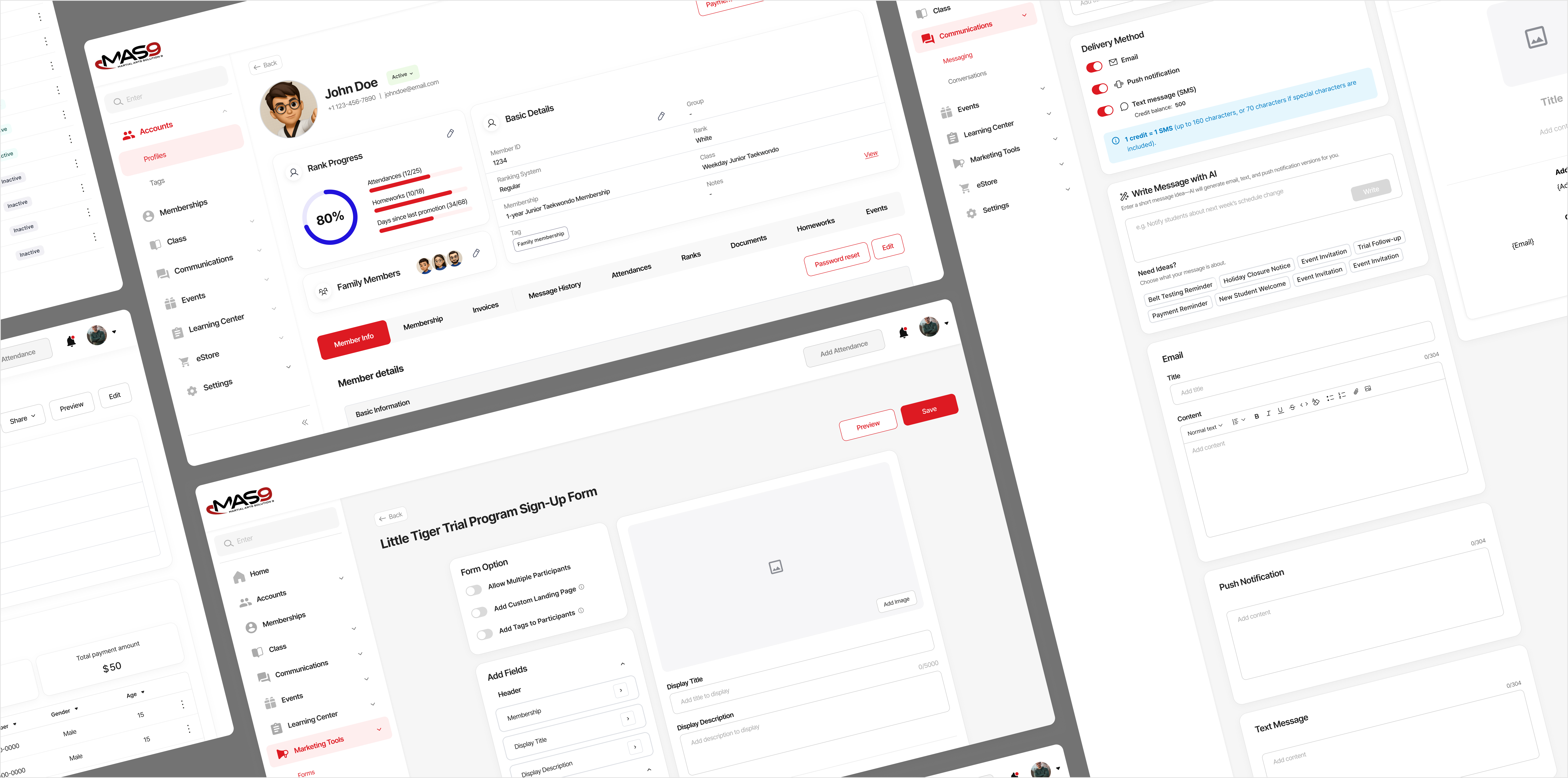
Designing and Building the MAS9 Product Website
Structuring product information and sales touchpoints to help school owners evaluate MAS9
Context
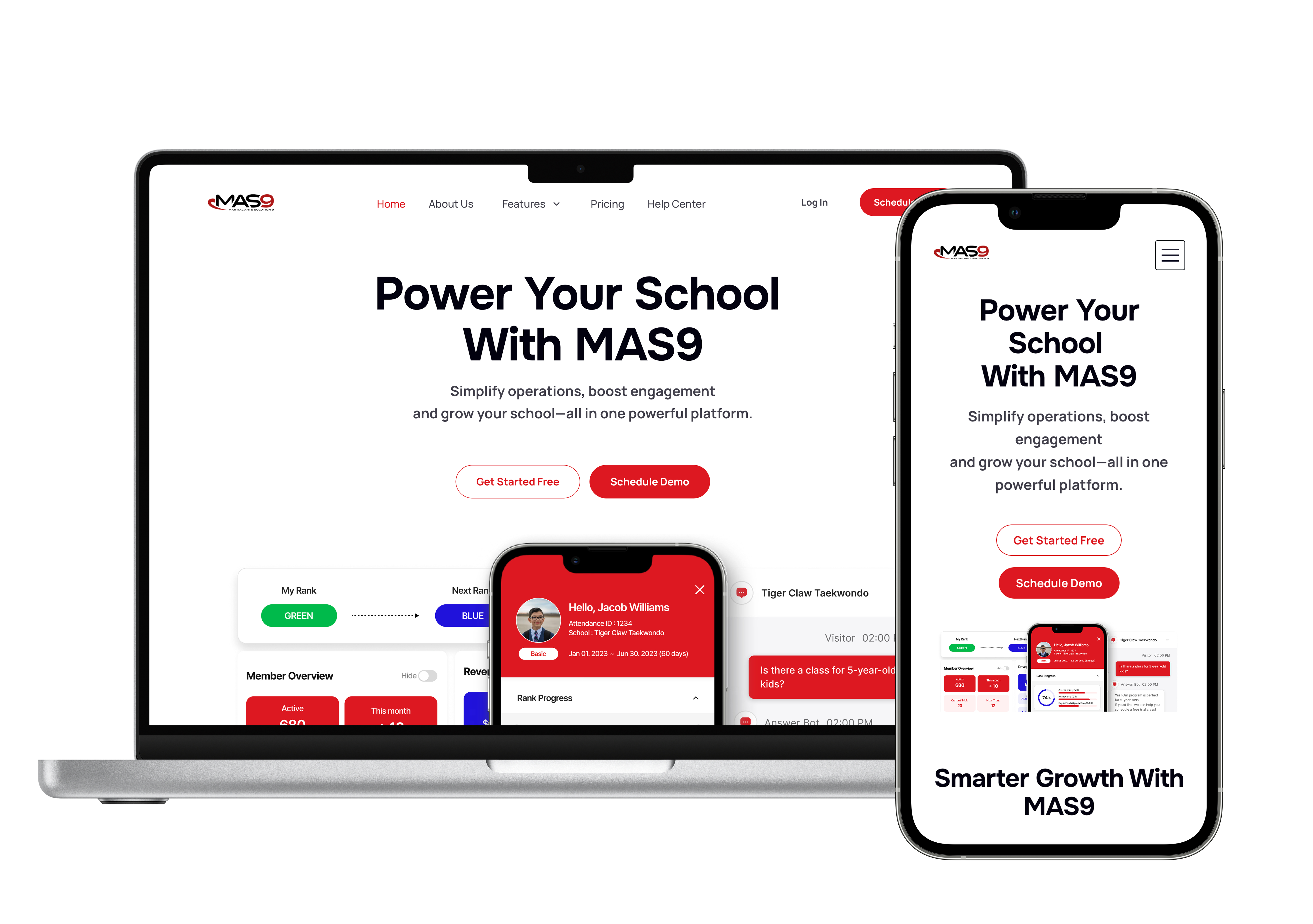
MAS9 had a working SaaS product but no official website that clearly explained what the platform did, who it was for, or why school owners should trust it.
As the sole designer, I built the website from the ground up—from information architecture and content structure to responsive UI and Framer implementation—creating a clear product-evaluation experience for prospective customers.
Problem
The Product Existed, but the Product Story Didn’t.
Without an official website, prospective school owners had no clear way to understand MAS9’s features, services, pricing, or credibility before speaking with the sales team.
Approach
Design Around the Customer Evaluation Journey
I structured the website around the key questions school owners would have before taking the next step.
01Awareness
What is MAS9?
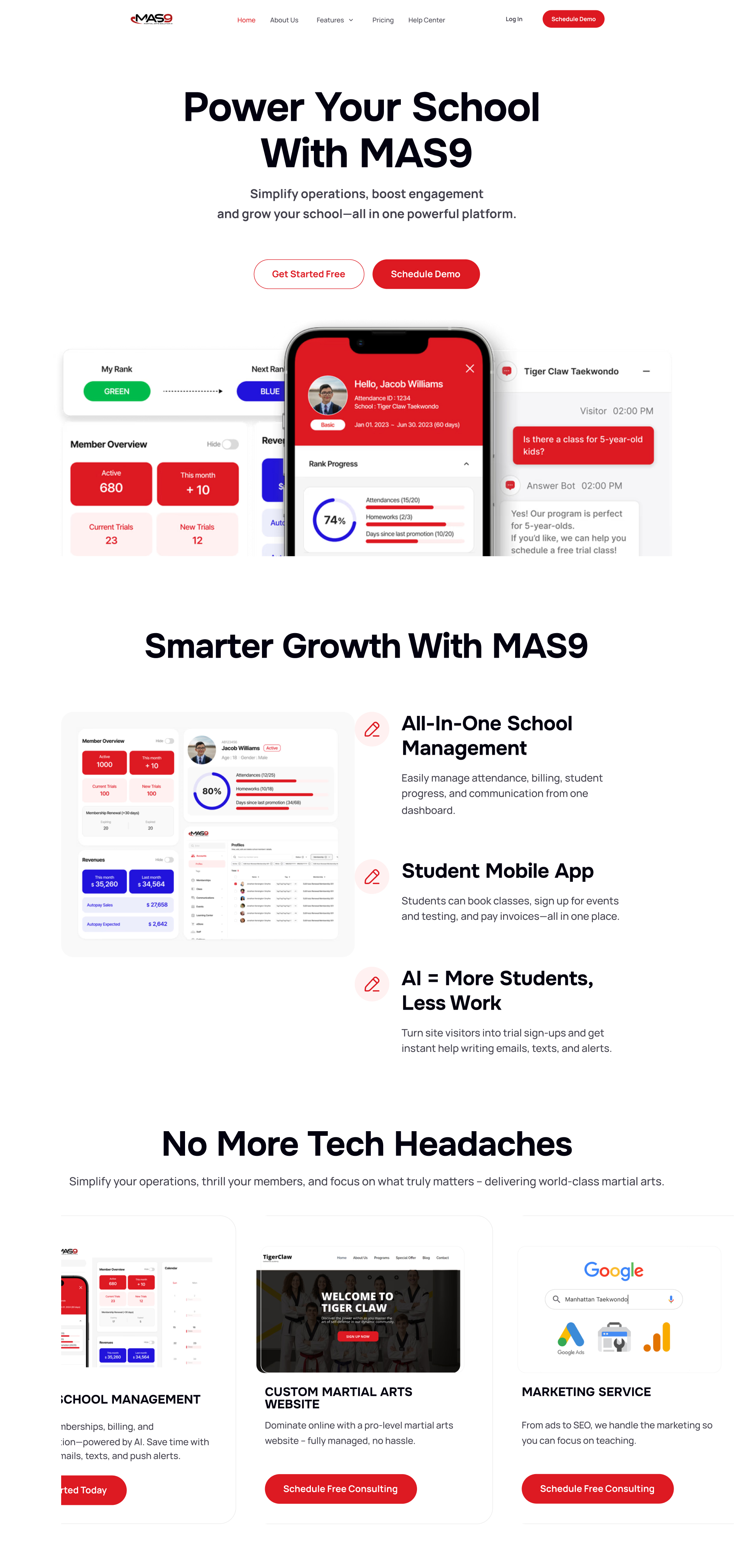
Home — Introduce the product and core value quickly.
02Credibility
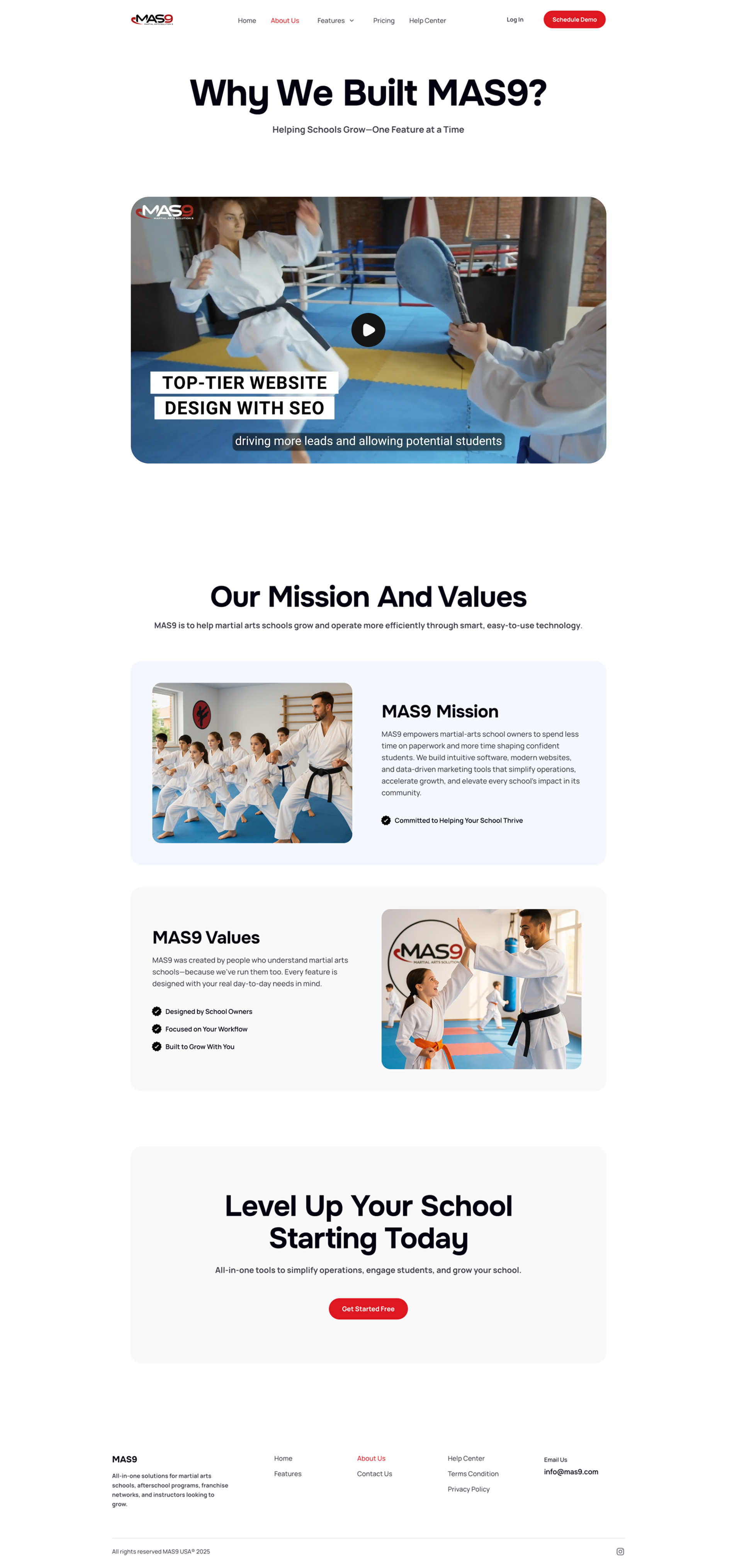
Can I trust this company?
About — Explain why MAS9 exists and who is behind it.
03Evaluation
Does the product fit my school?
Features — Help owners evaluate product fit.
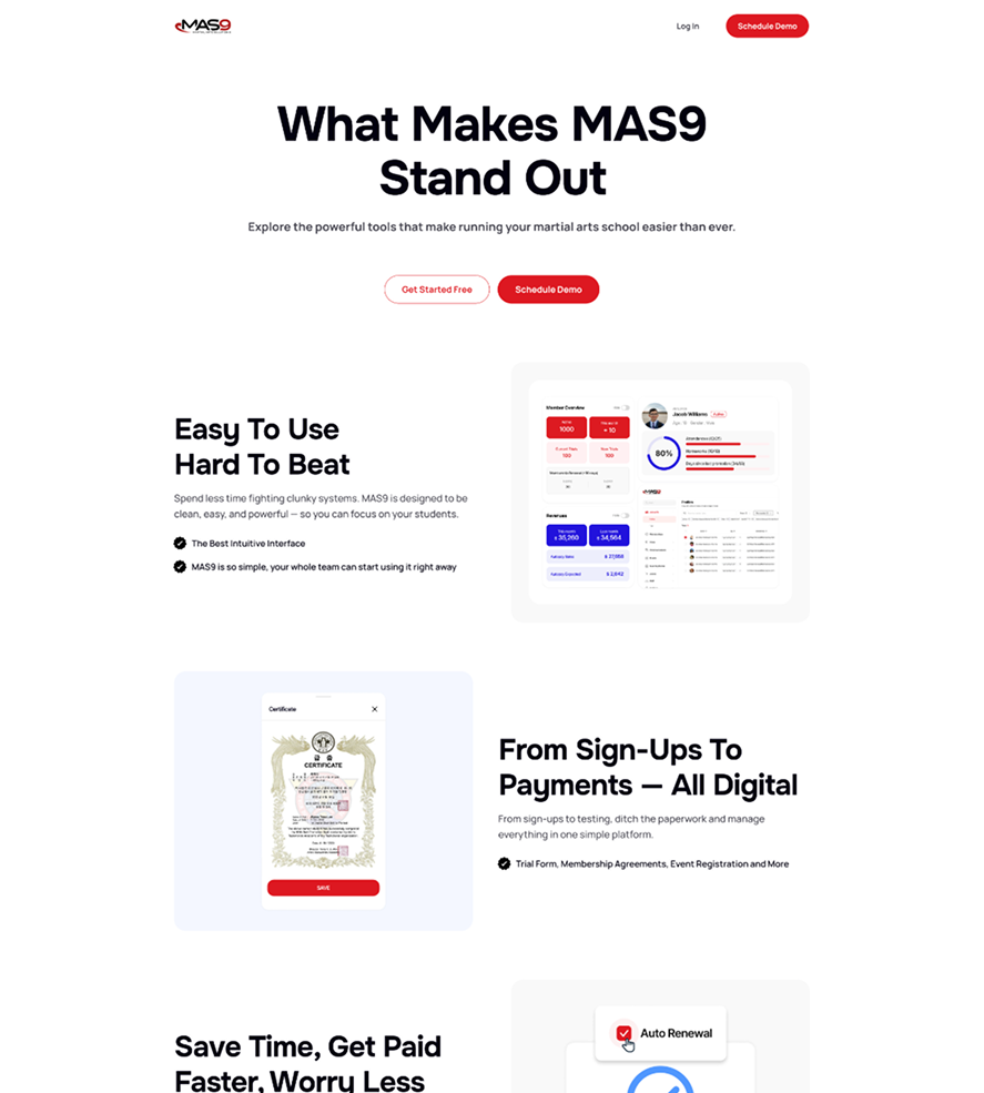
04Decision
What does it cost, and what do I do next?
Pricing — Clarify cost and next steps.
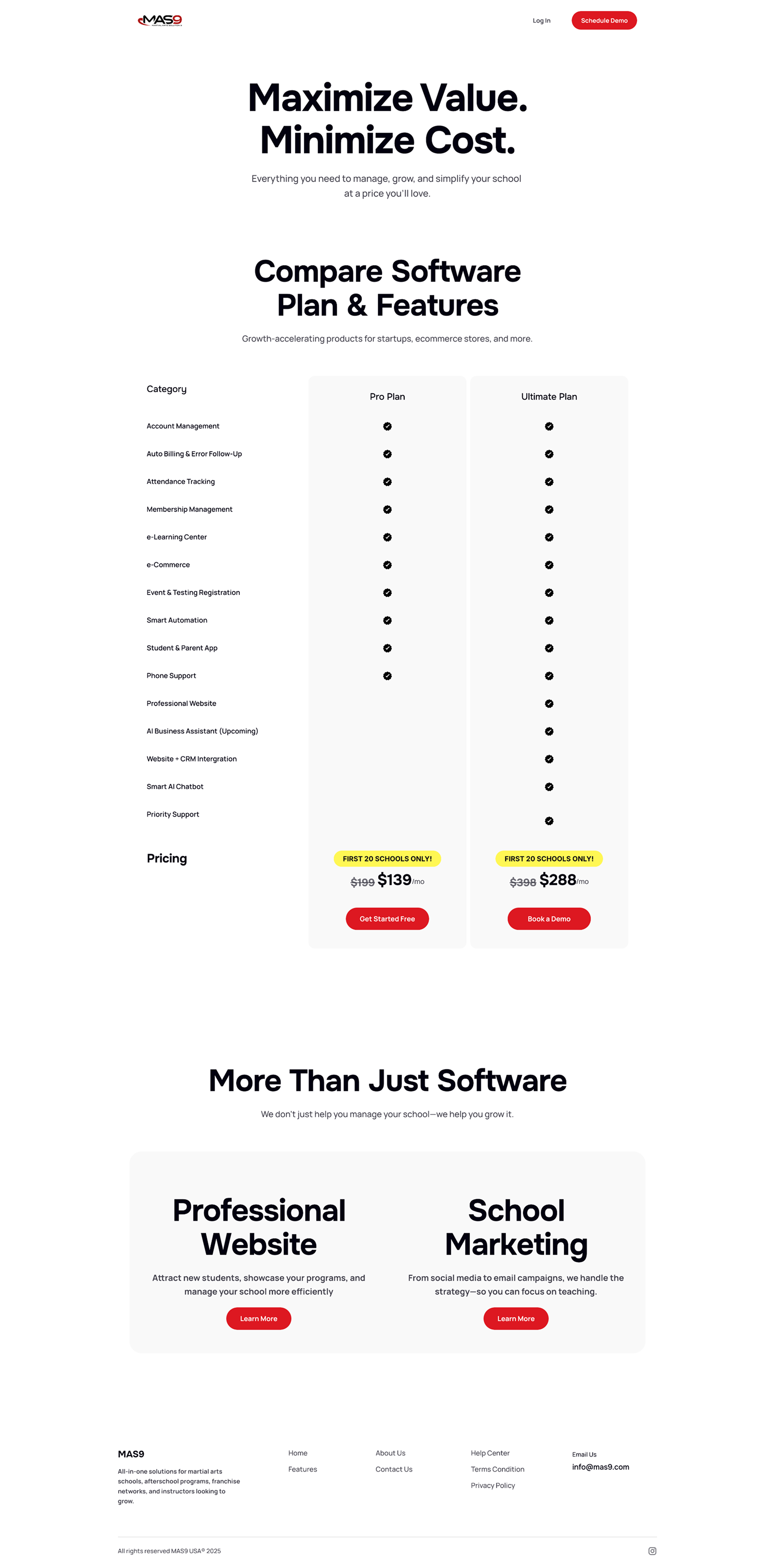
Sitemap
This journey became the foundation for the site architecture.
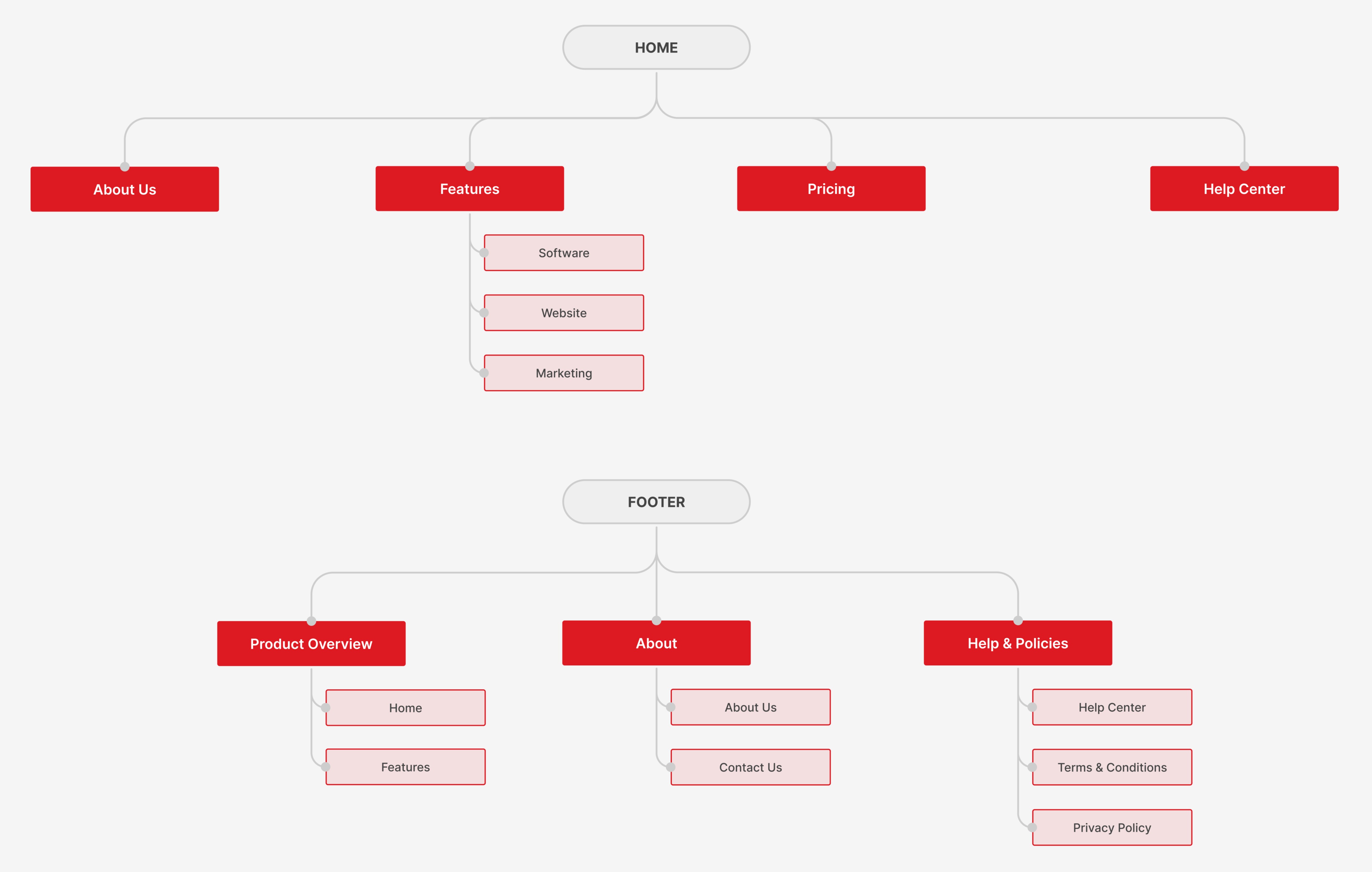
With the information architecture defined, I focused on how each page could communicate MAS9’s value quickly and clearly.
Design Decision
To help school owners quickly understand and evaluate MAS9, I focused on four things: making the product easy to scan, making the product tangible, making the next step clear, and designing for evaluation on any device.
01
Make the Product Easy to Scan
Used concise copy, strong visual hierarchy, and focused feature content so visitors could understand MAS9 without reading dense explanations.
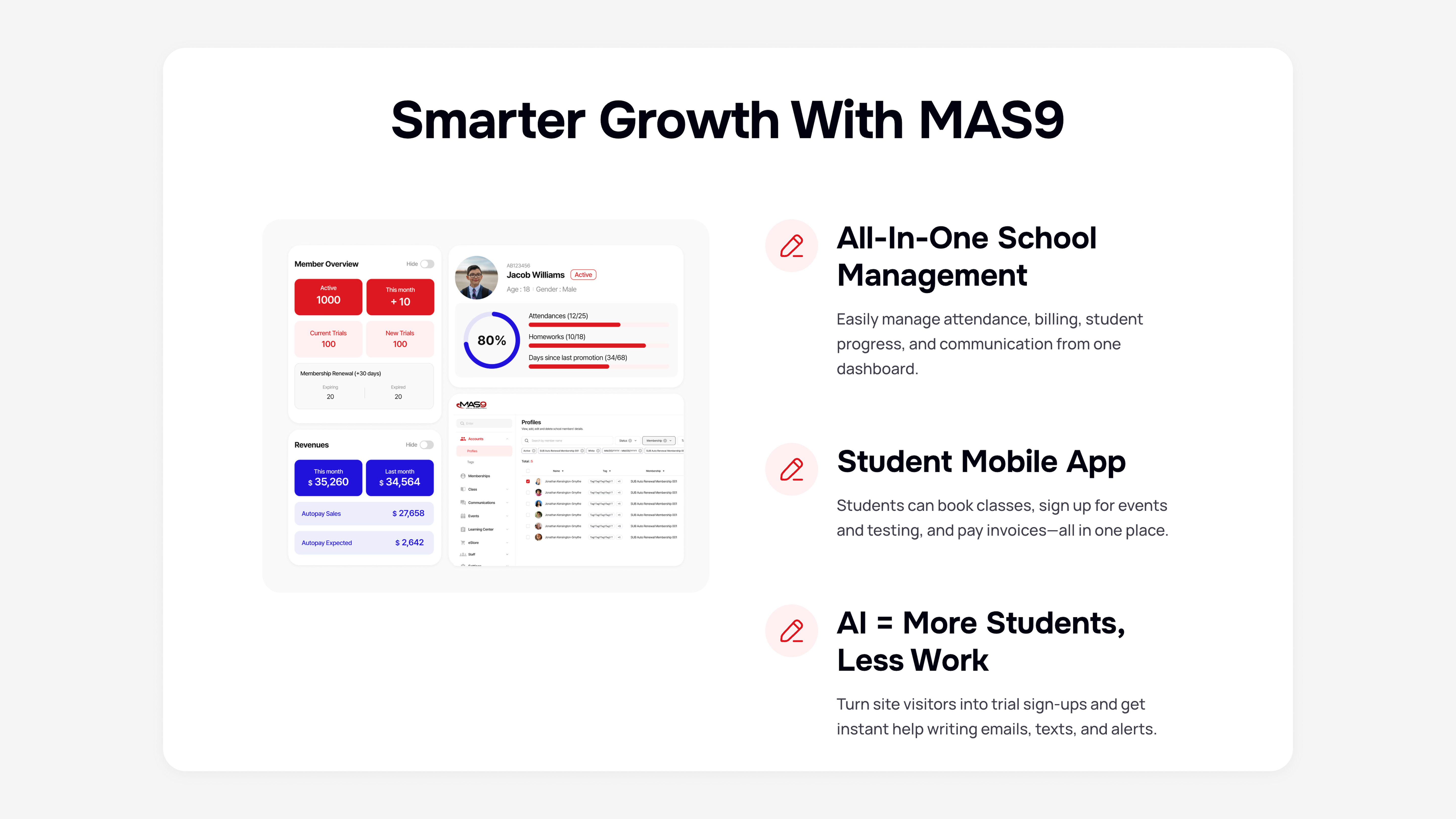
02
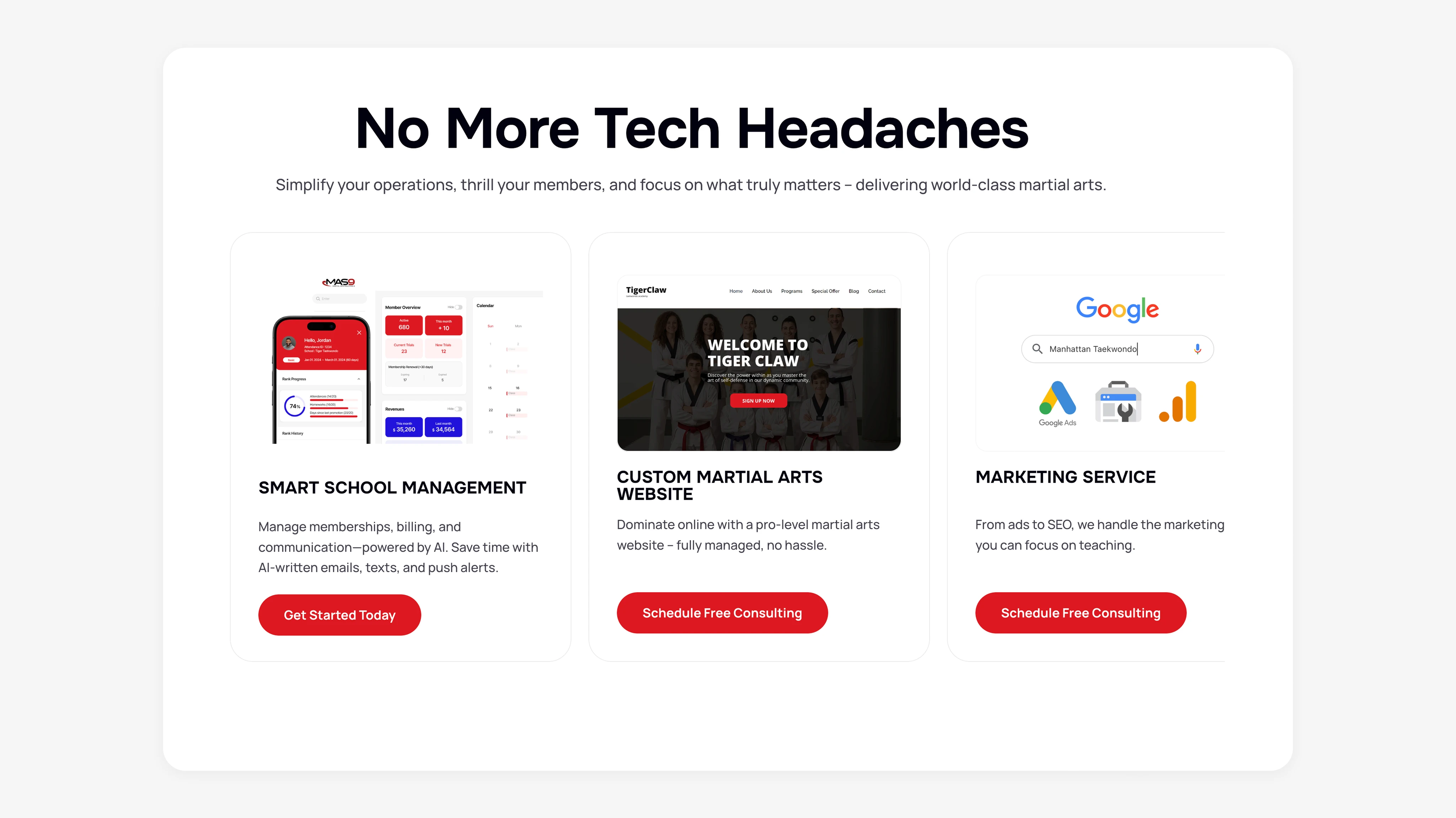
Show the Product, Not Just Describe It
Used real product UI and clearly separated MAS9’s three offerings—management software, website services, and marketing services—so visitors could quickly understand what they were evaluating.
03
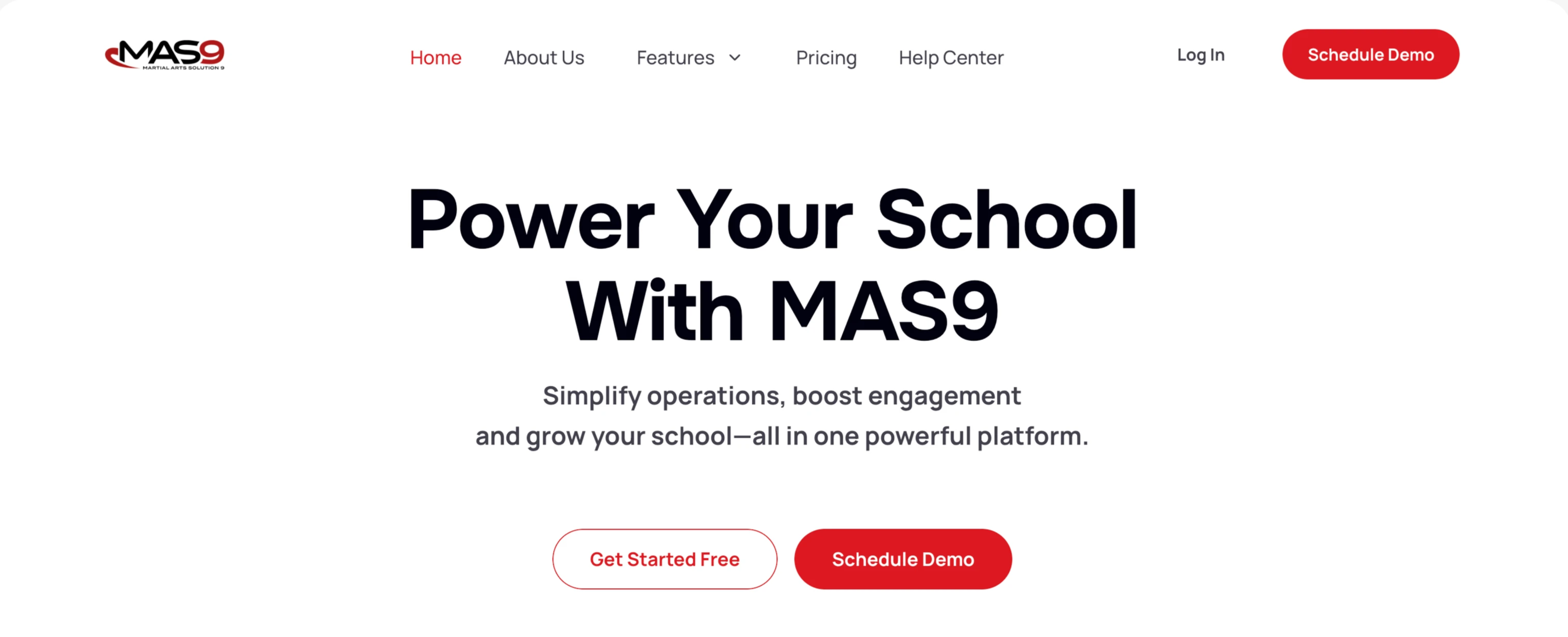
Make the Next Step Obvious
Prioritized Schedule Demo as the primary CTA, with Get Started Free as a secondary path for visitors ready to explore on their own.
04
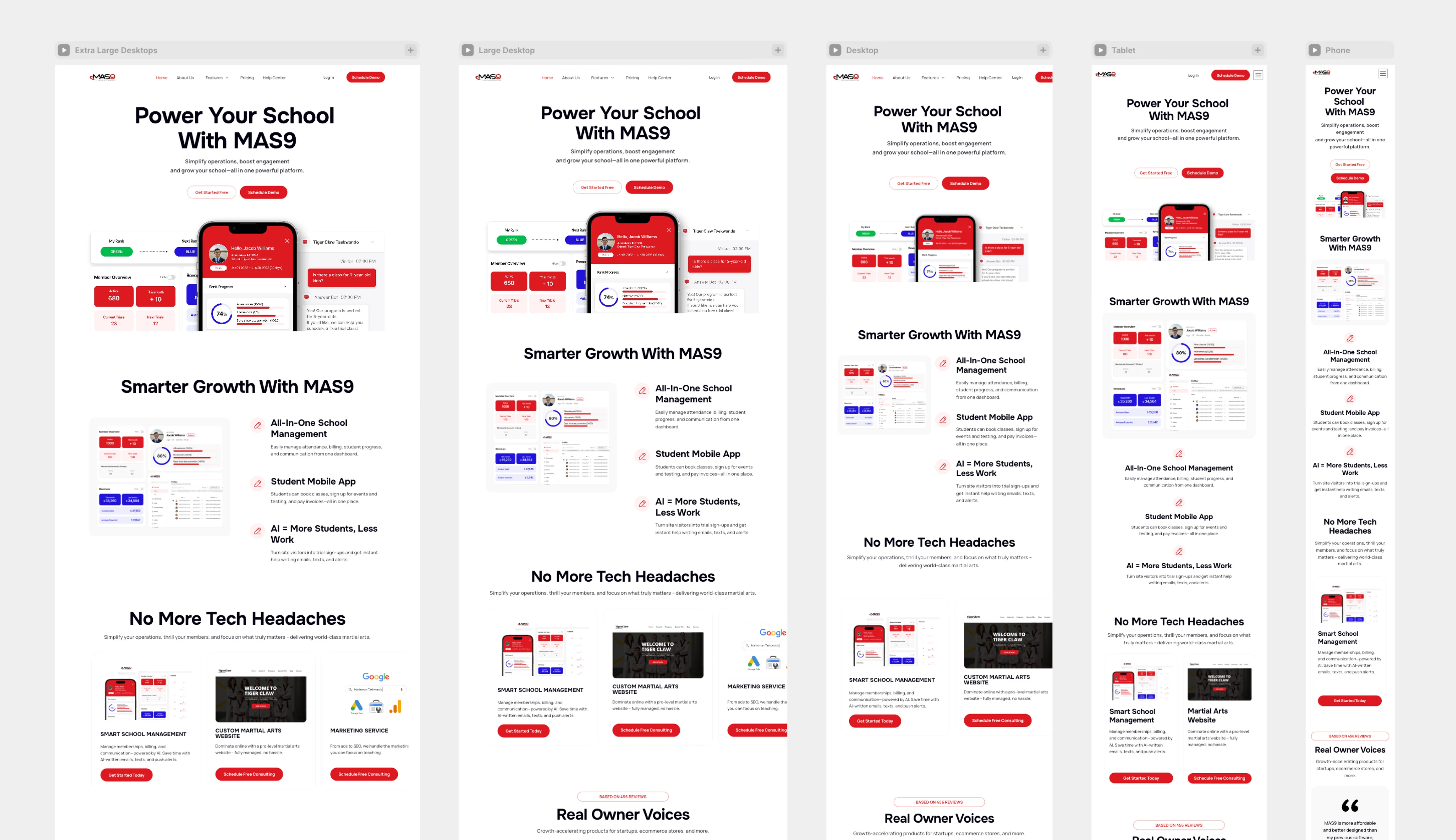
Design for Evaluation on Any Device
Prospects often discovered MAS9 at in-person events, browsing on their phones between conversations. I designed responsive layouts across five breakpoints so the product story, real UI, and CTAs stayed clear from large desktop to mobile.
Result & Learnings
Impact
The website became a useful sales asset during national taekwondo events, giving prospective school owners a place to explore MAS9’s features, pricing, and product value before or during sales conversations.
Evidence
What I Learned
Treating the site as part of the sales journey changed how I made design decisions: I structured information around buyer questions, used real product UI as proof, and prioritized mobile because that’s where prospects actually evaluated MAS9.
Next project
Designing Registration and AI Messaging Experiences for MAS9